ARIA, BPM, CoCo, DMG… Investment Application Design
Tags: UI DesignUX ConceptResearchPrototypingDesign System Project start: – Project end:Introduction
Section titled IntroductionIDS (Investment Data Services) is an Allianz internal company that helps other internal companies manage and work with investment data. They collect data from various sources, like Revinitiv or MSCI and internal data and standardize, store, analyze it and do quality checks. They then make it available to their clients in a suite of web applications, which they develop together with their clients.
In 2019 IDS started an initiative to modernize their suite of tools and processes. IDS also launched a new corporate design and wanted to bring the new look and feel to their applications as well. In late 2020, my team was brought on to help with redesigning of tools and services, which I joined in 2021.
IDS Design System
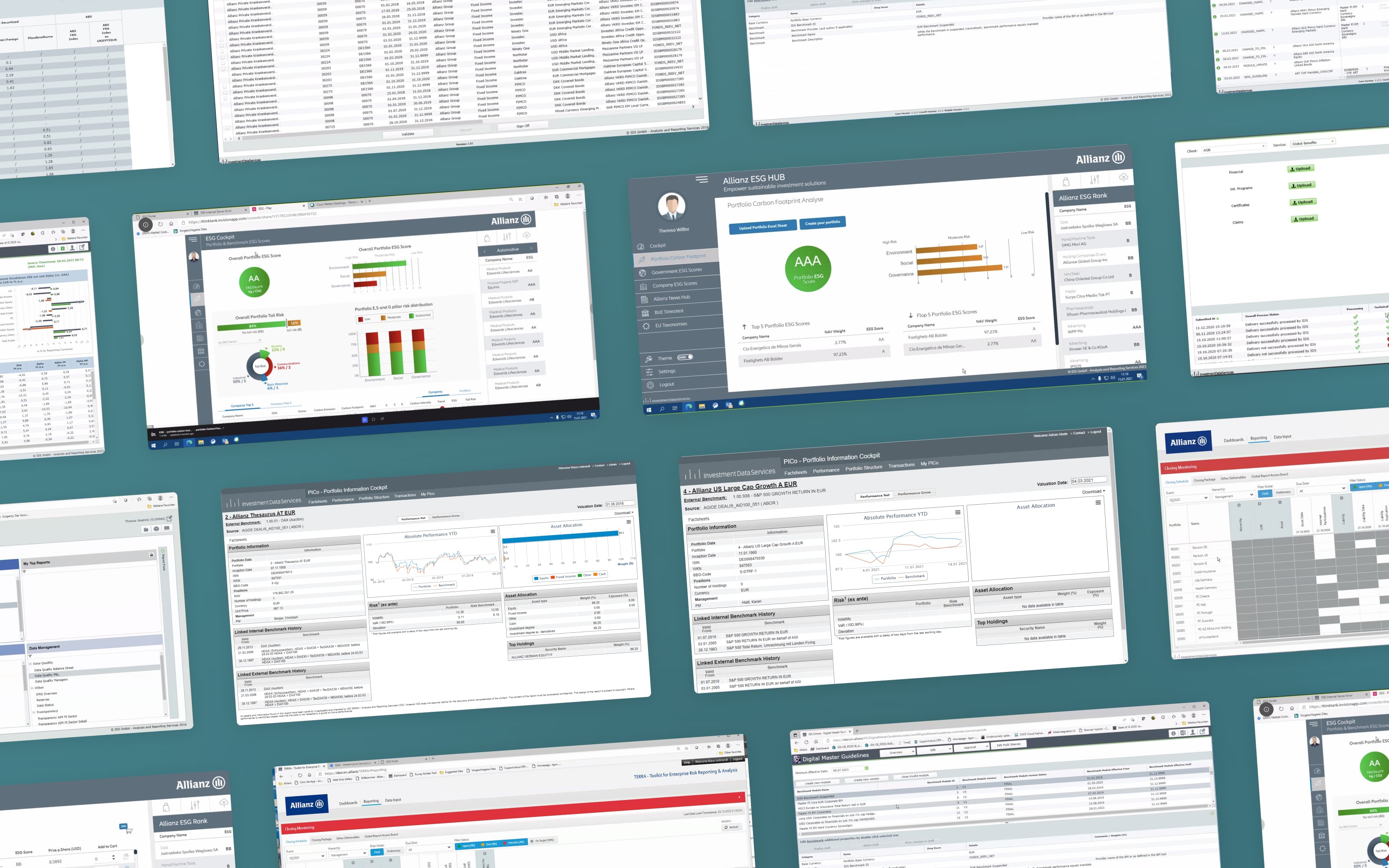
Section titled IDS Design SystemIn total, there are over 30 different applications currently in use. Some of them were over ten years old, and many of them used different component libraries and design patterns, which made them all look and feel differently. This status quo was frustrating for users, especially the ones working with multiple tools. Different development stacks were also increasing costs and complicated planning.
The solution was to develop a new design system to unify UI and development across apps. We used Aquila, an open-source component library from Allianz and adapted it to the needs of IDS. We optimized typography, particularly numbers in dense tables. Spacing in components to better fit data-heavy applications, see the EPIC case study here, and included the new IDS corporate identity as well.
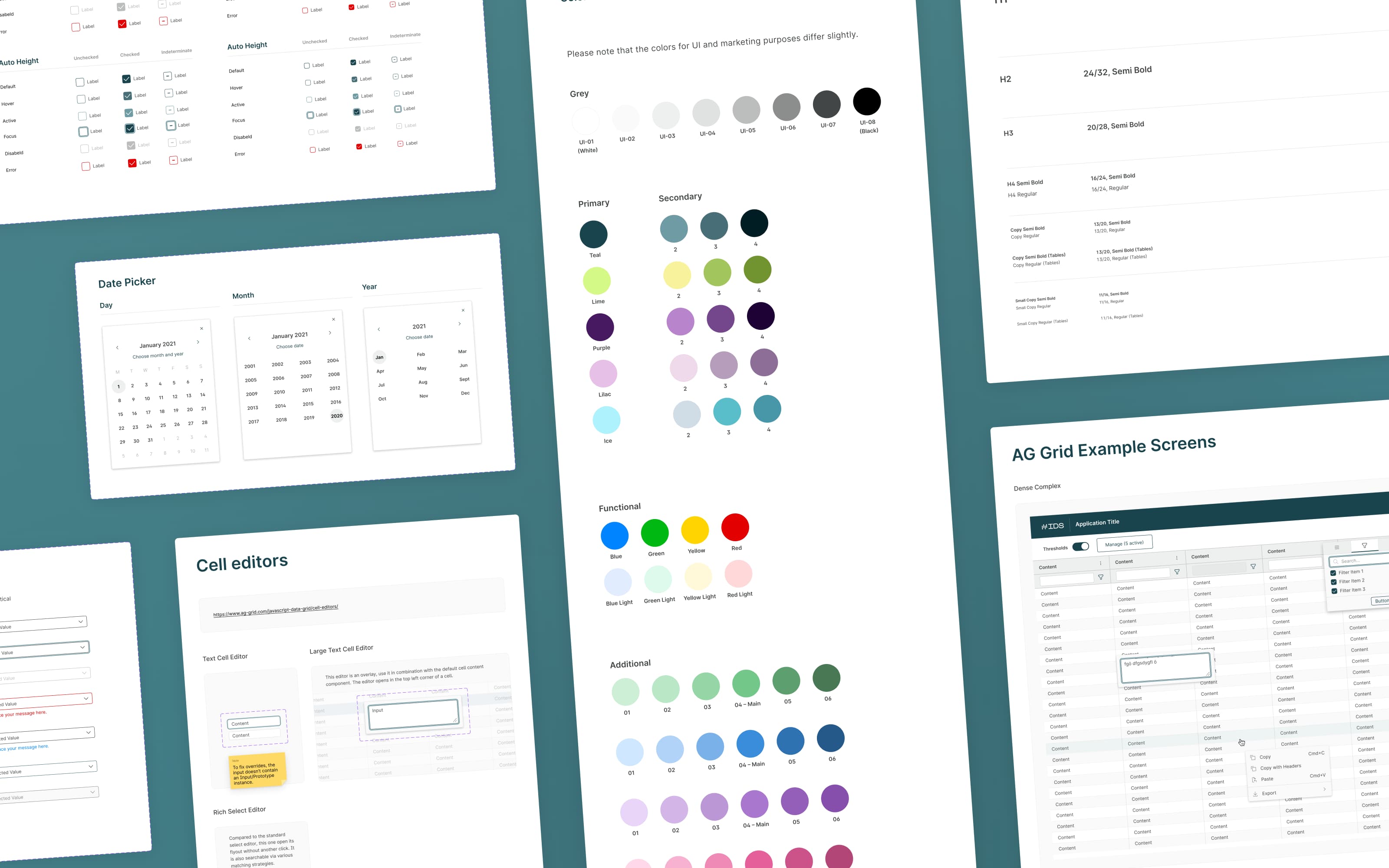
I want to highlight my work on a new table component system, based on AG Grid, the new framework used in many IDS applications from now on. I optimized the components from the beginning for ‘designer experience’, making sure we had high performance and flexibility.
With this Design System we could reduce development time and raise and standardize UX across the entire product suite. It is constantly being improved and together with a pattern library of often used functionality like lists, downloads and detail views, will be a central asset of IDS’ frontend development efforts in the future.
ESG Hub
Section titled ESG HubESG Hub is a new tool for investment managers to measure and keep track of their portfolios’ sustainability metrics. Together with experts from IDS, AIM (Allianz Investment Management) and ARE (Allianz Real Estate), we developed an application concept and data visualizations to help investment managers keep an overview and make decisions.
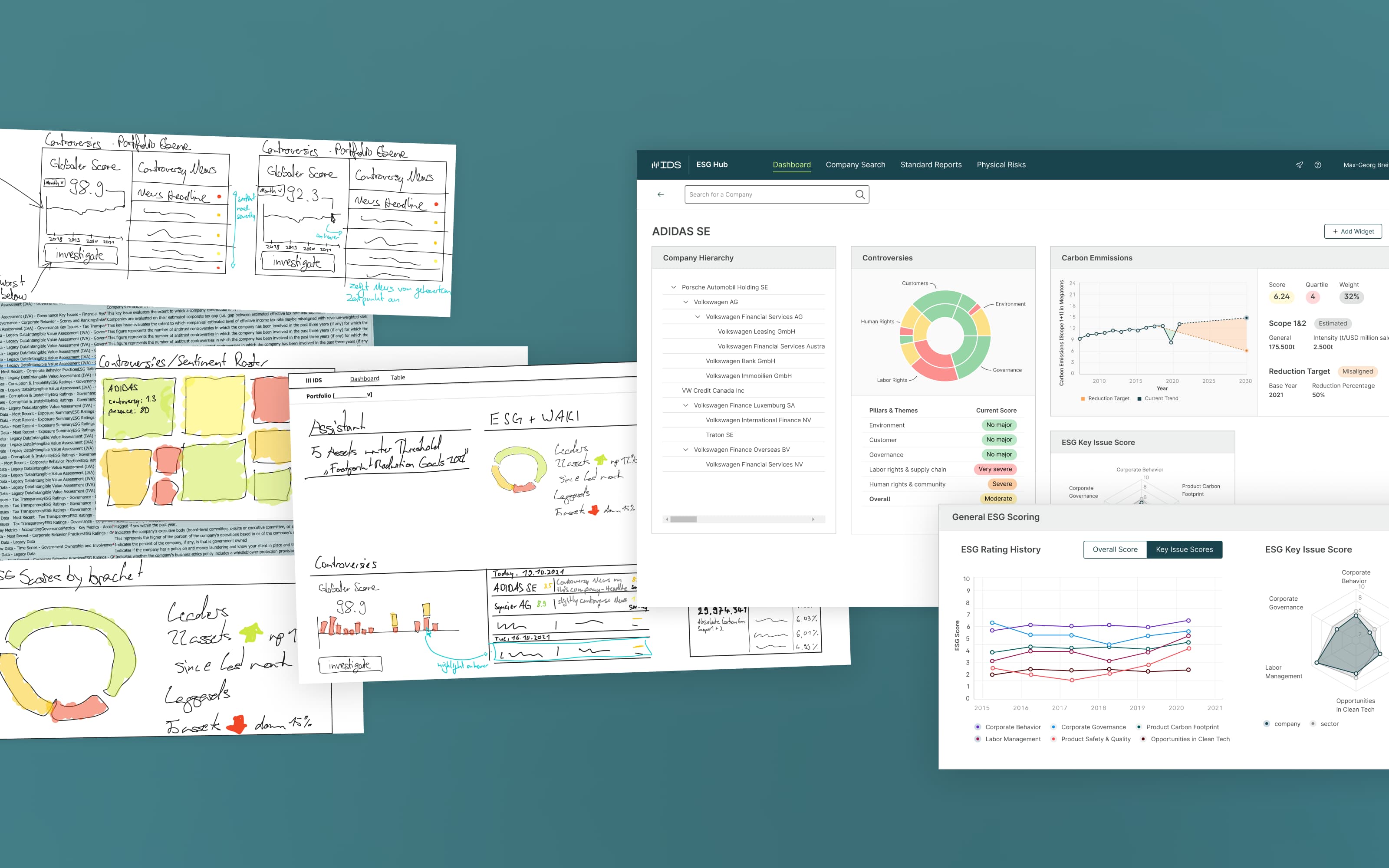
Even though the interface seems simple, we spent a lot of time getting to know the processes that lead to investment decisions and what data is most important to the users. We interviewed potential users for this application from AIM and ARE and created several interaction mappings. During research, we gathered a long list of potential features and defined a MVP (minimum viable product) that included the most important ones.
A first version of the MVP was then built by IDS , which we then used for testing with the customers and IDS internal colleagues. The application has been in continuous development since and more sustainability areas, such as physical risks for real estate, have also been designed and developed.
DMG 2.0
Section titled DMG 2.0DMG (Digital Master Guidelines) is an existing IDS tool for managing and versioning investment guidelines. It was created on an older JavaScript frontend framework, with many changes and additions over the years that introduced technical debt and UX inconsistencies. We were asked to develop a redesign for it in summer 2023.
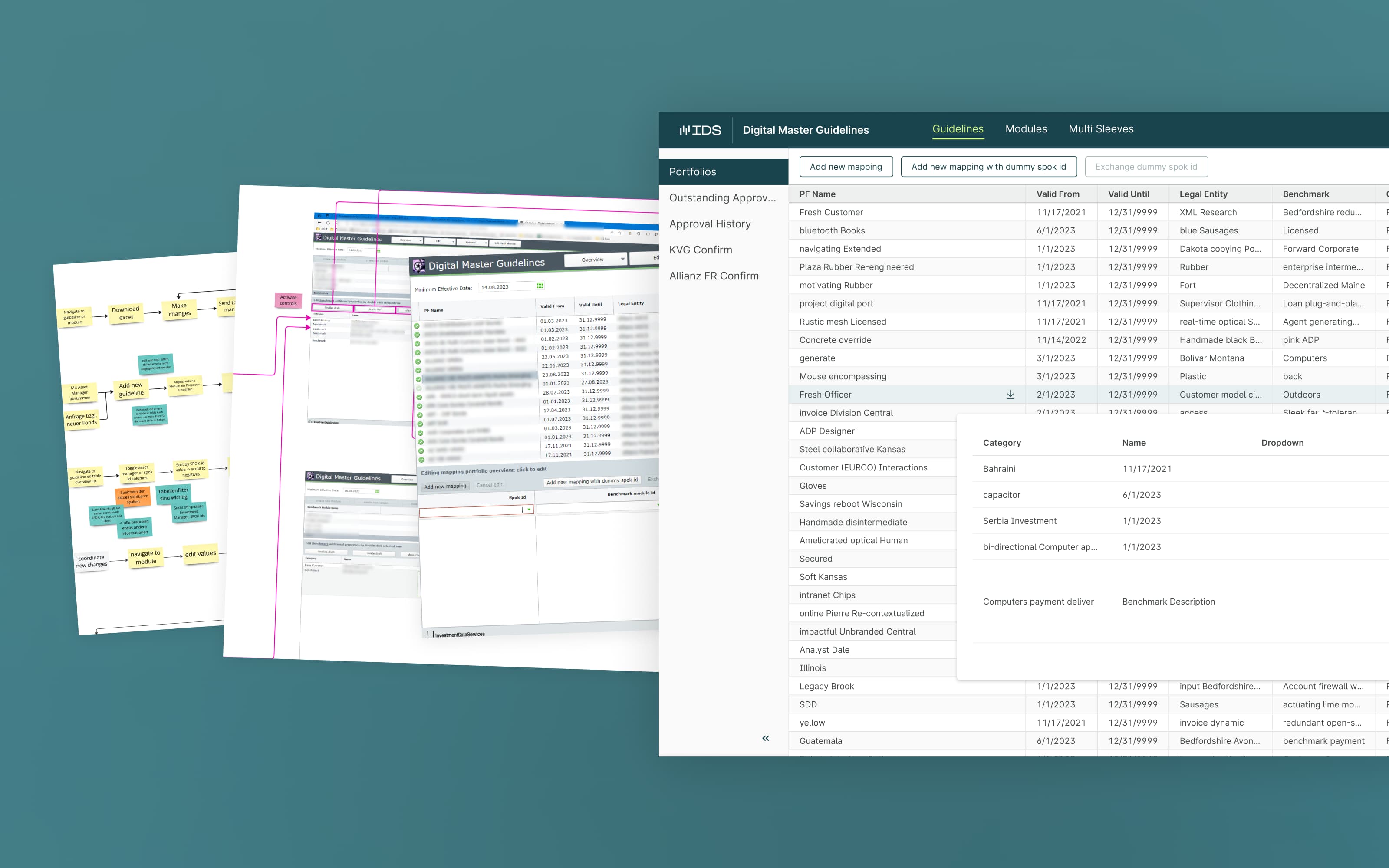
We started the project with an assessment of the current version and processes behind it via usability tests, interaction mappings and feedback gathered from expert interviews. We then sorted the findings into positive items, negative items, ideas and prioritized them. We were careful to keep the overall processes similar, and limit disruption of the existing users’ workflow. It helped that it worked reasonably well. However, we introduced many quality of life adjustments, like popover detail views and a clearer editing and versioning flow and navigation structure.