Ergonomic Grid Component System
Date published: Tags: Design SystemComponentsFigmaAs mentioned in a few other posts, my team and I have been working on data-heavy applications for IDS (Investment Data Services) for a few years. Because many applications have one or more tables more or less permanently on screen, we needed a grid component system that was not only performant but also flexible, easy to use and fast to work with.
We decided to build our own component system based on AG Grid, which was also the framework chosen for the live applications.
Designer Experience (DX)
Section titled Designer Experience (DX)In the development world, a good ‘developer experience’ as explained here by GitHub aims to increase ‘developer productivity, satisfaction, and operational impact’ and an overall enjoyable experience when using certain products or services.
Similarly, ‘designer experience’ – unfortunately also DX for short – in the context of component libraries stands for ergonomic components that follow a designer’s mental model. They should not get in the way when designing or need regular detaching. For good DX, a balance between helpful presets in the form of component properties and flexibility via slot components is important. Well thought out nested components and resize constraints are equally important so that designers find their way around the library and can use them without friction.

Component Design
Section titled Component DesignOn a high level, cells are made out of three parts in our system: the cell component, an absolute positioned background and a content component in an auto layout. This gives designers high flexibility to change paddings, should some custom cell content require the full cell area for example, but provides a standard size for the default content types.
Content can be easily swapped via the instance property and, thanks to nested properties, things like the state of checkboxes can be set from the main component. Consistent layer names help Figma apply overrides, even when swapping, for example, from a plain text cell to a dropdown cell. This creates a flexible and extensible setup, which is needed since AG Grid is also highly customizable and our applications display all kinds of data. Designers can use the included content components, but custom spark-lines and other content is very easy to build.

Slots
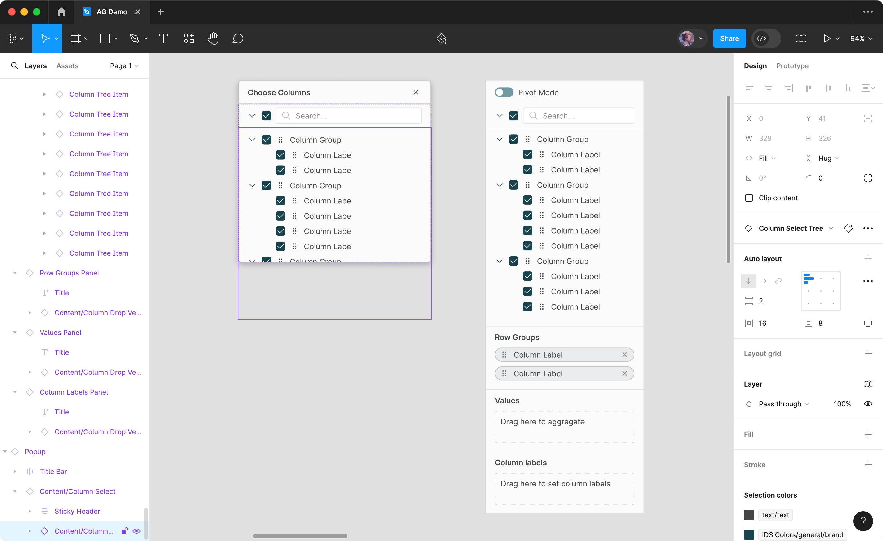
Section titled SlotsAll components are built with content slots, a term from UI development describing a placeholder where content can be inserted and exchanged. In Figma, components are very rigid and normally cannot be changed much. It is possible to change text or apply overrides. However, adding another item in a sidebar, for example, would not be possible. Content slots in the form of sub-components bring more flexibility, since they are the only elements that can be completely swapped out inside a component.
In the screenshot below, the main content of the ‘Choose Columns’ popup is one big component instance, as well as the different sections in the sidebar to the right. They are each broken down into small components that also have their own properties.
Tree Navigator
Section titled Tree NavigatorTo make my work with tables and other repeating elements easier, I created the Tree Navigator plugin. In the plugin, you select an element and then search for all elements with the same name simply by choosing one of the levels in the layer hierarchy above. As shown below, this also works with multiple columns, giving you the ability to quickly edit many cells at once.
Personal Learnings
Section titled Personal LearningsDeveloping this component library has been a great learning experience. Starting with no experience developing production grade component libraries, it has allowed me to become fluent in being able to plan, develop and maintain a library that is now being used by many designers. Resources like Into Design Systems have been very helpful, as well as trial and error and experimentation.