EPIC – Designing Internal Applications
Tags: RedesignResearchExpert User Interfaces Date published:EPIC is a web application for investment managers to track changes in portfolios and do reporting. It is maintained by IDS (Investment Data Services) and used by many internal Allianz investment management companies, in total a few hundred people. We were approached by IDS in fall 2023 to do a thorough analysis and create a redesign of this application.
The app is separated into three main sections: The first is a general overview of all Allianz portfolios, where users can download various types of reports. The second area is a powerful editor for custom reports, that allows to filter and preprocess data. Users will most likely process the data further in Excel, but since the amounts of data can be very large, it is a good idea to filter the data in advance. And lastly, an editor for investment decisions, which are automatically exported as PowerPoint slides together with investment data.
This project was part of IDS’ ongoing effort to modernize their service portfolio and to improve utility and usability of their tools.
For this project, I was in charge of research, user interviews as well as the concept and design phase. Since this was a redesign, our priority was to support and improve existing workflows, but we had some leeway for adjustments.
Research
Section titled ResearchAlmost all our users are experts in their field, so it was important to gather qualitative feedback on the current app. To get a good overview, we conducted many interviews, user tests and shadowed users of different teams. Goal was to see as many perspectives as possible and to find answers to our main questions:
- What are the users’ tasks?
- How do they do their tasks?
- How well can they do them?
- If so, what issues do they encounter?
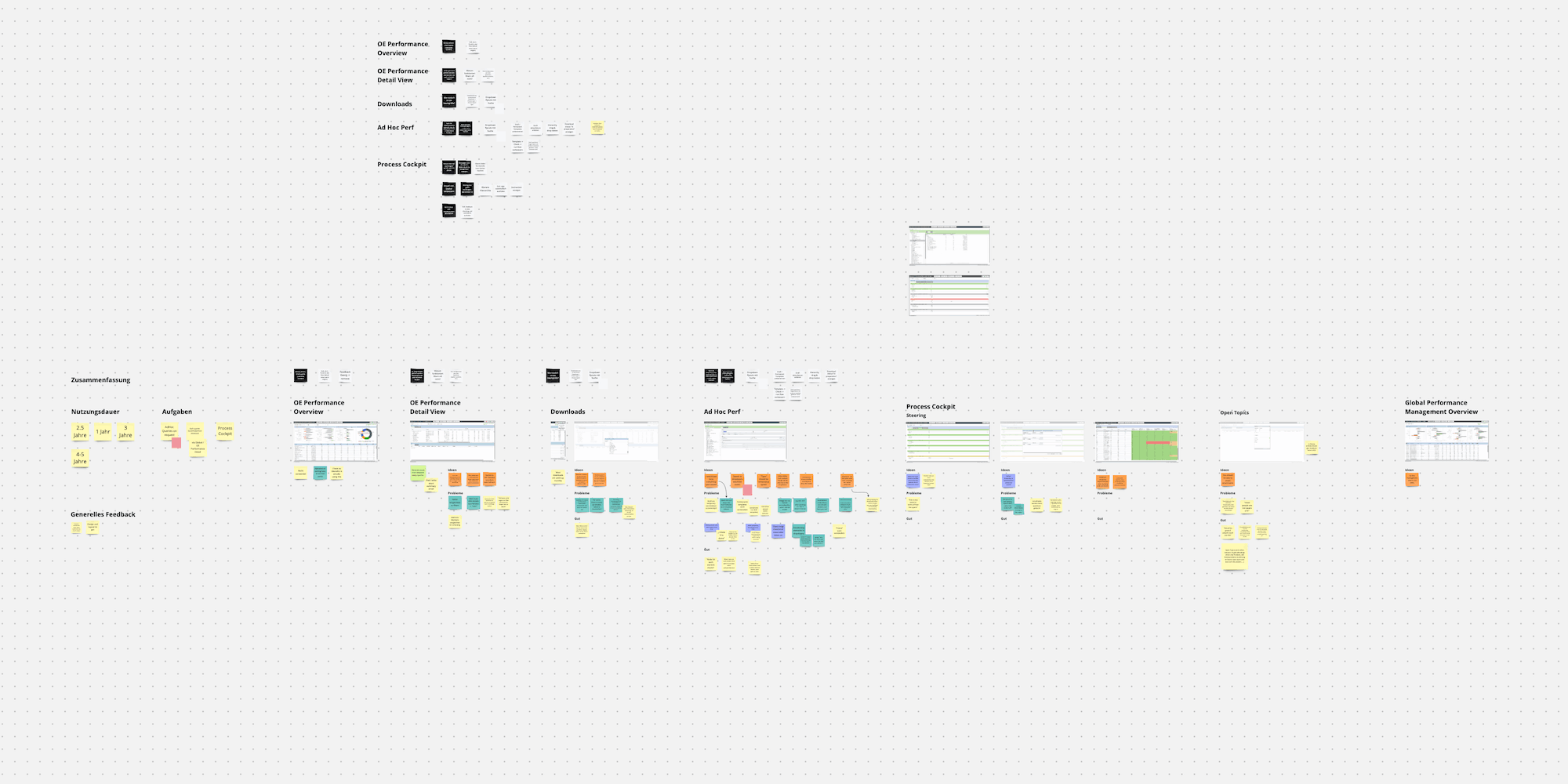
Many users of this application work with it daily. When we approached them they were eager to share ideas and suggestions for improvements. Their feedback and hints were very valuable in our research. Next, we mapped out the application, sorted our findings according to where they appear in the App1. Finally, we categorized them into ‘ideas’, ‘problems/opportunities’ and ‘what works well’.
Design
Section titled DesignI want to highlight two areas we worked on to show our process and impact in more detail.
Spotlight 1: Downloads
Section titled Spotlight 1: Downloads
In this screenshot, users can filter and browse a tree of Allianz’ investment funds. Users have to navigate to certain nodes and download them in one of many formats. Depending on what they want to do, this could be Excel to further explore the data, PDF for reports, and so on. The way this was done before felt stitched together because it grew from many small changes over the years. It was inconsistent and confusing.
There were two download options, separated by file type, each with their own drop-down. We found that users had trouble telling what they were about to download. To make matters worse, for some downloads users needed to select a fund from the tree first, or an error would appear. We also spoke to some users responsible for onboarding. Here we found the new users often asked what the individual downloads were for and which data they used.
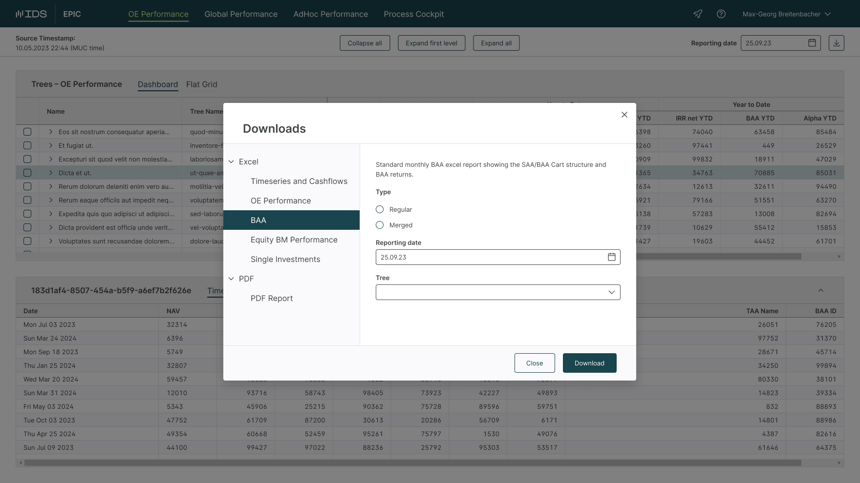
To solve the issues we found, we introduced a unified downloads modal. It allows users to choose between the different downloads, without picking one and hoping for the best. We also added descriptions with the help of domain experts to help new team members. For downloads, where it is necessary to make a selection, we made it possible to trigger them from both directions. Expert users can select a fund first and download it directly like before. New users can use the downloads modal and then select the data they want afterwards with a new select UI.
Spotlight 2: Templates
Section titled Spotlight 2: TemplatesAnother large area of the app is the templates section, where users can create customized downloads. It is possible to define filters, hierarchies and data sources. Users can save and run the templates to get up to date data and rerun them later.
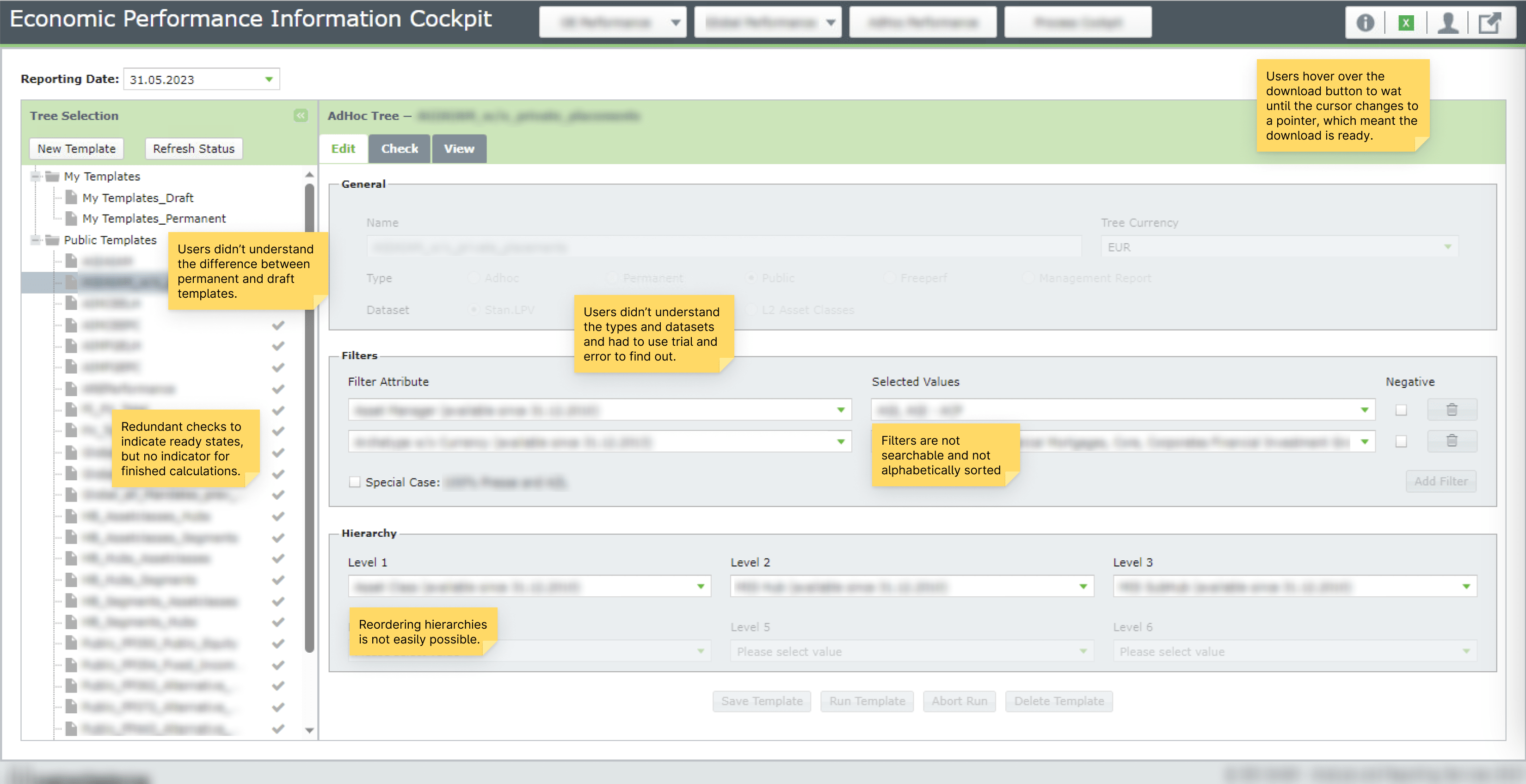
During template creation, we found many usability issues. For example, users had trouble choosing the correct data set and template type. Filtering drop-downs was not possible and to make matters worse, the lists were not sorted alphabetically. Instead they were sorted according to a net worth value that was not displayed. Reordering hierarchy levels was another issue, when users tried out different configurations. For each change they had to delete the value and switch it with another field manually.
When the cursor didn’t change to a pointer over the download button, they knew the calculation was still ongoing.
We discovered one very surprising workaround that some users found. It was so useful that they even shared it with new users during onboarding. A template run could take a few minutes depending on the settings. When a calculation was still ongoing, the download button would become disabled (without a visual cue, mind you). They then used the fact that the cursor would not become a pointer to check if the calculation was still ongoing or if it was already finished. A perplexing example of how users can find unintended hacks and workarounds for issues. It reminded me a bit of xkcd #1172, but it was definitely something we should make explicit2.
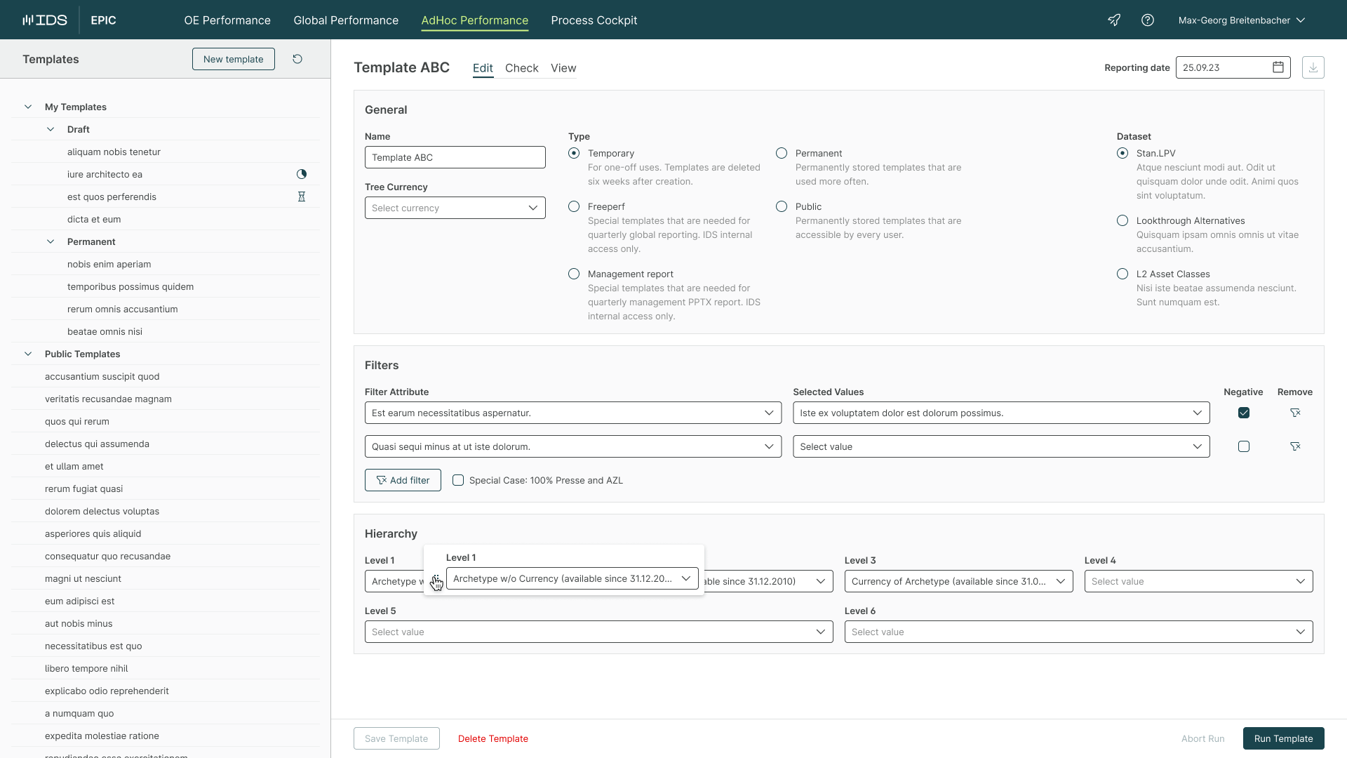
To solve these and other issues, we once again worked together with the relevant experts to add descriptions where necessary. Luckily, dropdown filtering was already supported by our new component library, which we could then use here. We also introduced a new custom feature to drag and drop hierarchy levels. Here, we had to research libraries and find settings that provided good usability.
Implementation
Section titled ImplementationTowards the end of the project, we started implementation of the new application concurrently with the remaining design tasks. We collaborated with developers in sprints and created handoff documentation for the interactions and behavior.
Designing for Power Users
Section titled Designing for Power UsersThe unique constraints of internal apps is a very interesting limitation when designing. Limited design and dev time makes it necessary to get as much as possible out of existing components. Knowledge of the way a component works, like slots and props is essential to create designs that can be implemented fast. Power users and their workflows provide challenges while redesigning apps, since new and existing workflows can clash. Sometimes apps grow organically into unintuitive frankensteins and larger changes are needed. Long time users might be accustomed to it, but easier onboarding for new team members makes it worth it.
This makes meeting people where they are so important. Stakeholders need to be on board to provide helpful feedback. Working on a few projects like this has taught me that this is key to a successful project. For this reason I’ve started doing more rather than less interviews to listen to existing users. Including them in the design process has also been helpful to make them feel heard. At the same time, it is important to strike a balance between including feedback, but also providing alternatives if there are other, better fitting patterns.
An excellent grasp of product design and usability fundamentals is important. Fluently applying small details, like status, empty and loading states, or use of space and elevation comes in handy when designing information dense applications. (And if you need to support everything from ultrawides to older iPads) I even wrote a custom stylesheet for AG Grid3 to have tight control over CSS variables that we could then use with large trees for example that required denser nesting, and so on. For this project we kept watch of mouse movements and made adjustments to the location of toolbars and controls according to what is likely to be clicked next. When your users spend most of their work days in the applications you build, it matters.
These and more are the approaches and tactics I learned to use when designing internal applications for power users.
Footnotes
Section titled Footnotes-
I’m not a person that likes to follow guidelines and processes blind. I view the design process as a toolbox, or an emergent process that depends on many variables and is different for each project. To keep it short, think about it as a mix of journey map and service blueprint. (Would be a good topic for a blog post though) https://www.nngroup.com/articles/ux-mapping-cheat-sheet/ ↩
-
System status is a very simple – but surprisingly often missing – cue that improves usability of applications a lot. https://www.nngroup.com/articles/visibility-system-status/ ↩
-
A very powerful table framework that we made extensive use of. https://www.ag-grid.com/example/ ↩