How to Create Robust Figma Icon Components
Tags: TutorialIconsFigma Published on:For the past few years, I worked on various projects as a user, maintainer and author of internal design systems. I’ve spent a lot of time finding ways to build robust components, improving ‘designer experience’ and usability. A recurring topic has been the handling of icons and in this post I want to show how we use icons in our design system. As great as Figma is, it is not without its issues and from my experience, icons are an area where we can and have to use many tricks and techniques to achieve good results.
This post assumes basic knowledge of components, instances and libraries in Figma. I recommend visiting Figma learn and the official tutorial files as an introduction.
Community files are a great source of icons. In our team, we either search if there is already a file of the set that we want to use available, or we build our own libraries with Icon Library Manager. I’m currently working on a post on how we do that. If you’re interested, you can read about how to import SVGs and update your own libraries in the next post here. In general, there is always at least one library file that we use to insert icons in our designs.
With that out of the way, let’s imagine you want to create a button component.
Icon Buttons, the Naive Way
Section titled Icon Buttons, the Naive WayA very simple approach would be to create a label text and insert an icon from your file or library directly. This works pretty well. You, the design system maintainer, can change its color to create secondary and tertiary variants according to your style guide. Designers using your component can select the icon, swap it with another icon and select different button variants. In the screenshot below, I created a simple primary button with a white label and icon. What could go wrong?
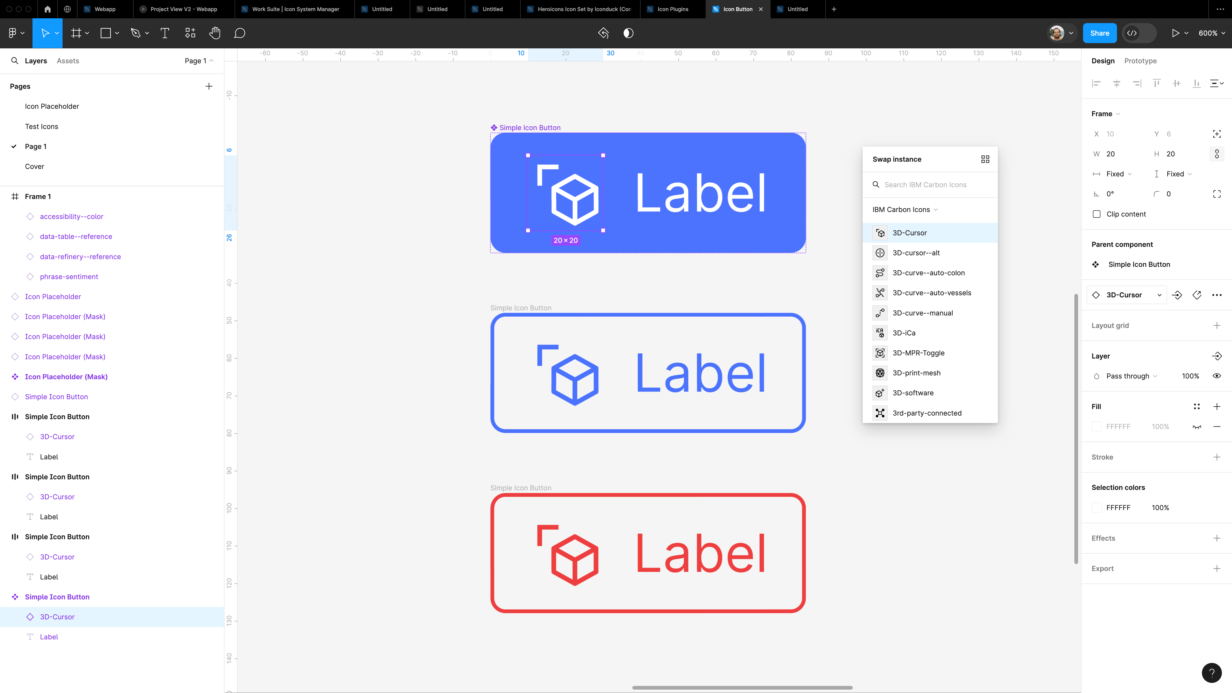
Turns out a lot. (relatively speaking)
When we swap the icon out to customize our button, some parts of the icon become black again. What happens here is that Figma tries to apply the white color override of the original icon on the swapped icon. This normally works fine, but because the new icon has more layers than the original instance, the extra layers appear in the default color.1
This issue is sometimes hard to spot. In the IBM Carbon icon file that I maintain for example, all icons are converted to outline strokes and then joined together into union groups to minimize the chance of this happening. But there are always some icons that can’t be completely reduced to one element and the issue will eventually pop up.
A Better Approach: Placeholder Components
Section titled A Better Approach: Placeholder ComponentsSo, how to fix this issue? Instead of applying color to the icon layer, we can use an extra helper layer on top of the icon. Now there is always only one override for Figma to take care of and we don’t have to care what color the icon paths have anymore. To restore the icon paths – since the icon would now be hidden behind the color layer – there are two possible solutions. We can either mask the color layer with the icon or create an intersect group with the layer and icon. This means the icon only provides the shape that gets ‘punched’ into the color layer, which is the one that is actually visible in the end.
During testing I discovered the intersect technique actually suffers from a similar problem as I mentioned earlier. If there are more paths after swapping an icon than before, the intersect operation stops working, making the approach very fragile. You can experiment with it in the playground file below, where I’ve included all methods I mention here.
Because of these issues I use a mask in my icon placeholder component. To construct it, we first have to navigate around what seems to be another bug. Swapping out the icon in an instance, causes the mask to stop working. But we can circumvent this by wrapping the icon in a group first. Then we place a rectangle as the color layer on top. Now we select both layers and apply the mask with ⌃ ⌘ M and finally create the component with ⌥ ⌘ K.
To make the component a bit more nice to use, I like to create an instance swap property for the icon. So when using it in designs, it is easier to select a different icon without having to dig deep into the mask. Also make sure all layers have their resize constraints set to ‘scale’ to make the component resizable.
Playground
Section titled PlaygroundI’ve prepared a playground file with the different methods I mentioned above, so you can try them yourself. You can also copy the placeholder components directly into your libraries.
Open playground file
Thank you for reading! Let me know what you think and how you are using icons in your team on Threads.
Visit the next post for an introduction to Icon Library Manager to create your own icon library files.
Footnotes
Section titled Footnotes-
See the Figma documentation on overrides for more details. Basically, Figma tries to match layer types, names and the layer structure to restore any values that the user may have changed. That only works for layers that existed before the swap or at least can be matched.
Since all layers in the example icons (see the playground file) are called ‘Vector’, the overrides are only applied to the same number of ‘Vector’ layers that previously existed. If there are any extra layers, Figma assumes they are new and simply gives them their original color. ↩