Designing the Destinations Website
Tags: Published on:
It’s time for a new Website.
In February, I came back from my small break during winter that I took after finishing my degree. Around that time we also placed top three at the goHfG award and decided now it’s the right time to get serious about our project’s presentation and to show it to the outside world.
Directly after we officially finished our project at the University I developed a small website to show and explain what our project is about and what our thoughts were while designing it. We wanted to recruit more team members for our project and have a platform for news, announcements, and new developments, with the goal to get the attention of other people and make them interested in working with us. The design was done rather quick with a video showing our use case being in the center, and highlights of a few major features not unlike a standard product page.
My first version of our website served its purpose, but now we wanted to take it a step further and start to think about an actual identity.
Finding a Design Direction
Section titled Finding a Design DirectionOur first versions’ design was more or less based on the slides of our final presentation with a dark background and blue outlines for elements in the front although I adapted the design and added a few features to the design system.
We wanted to play into our strengths of communication and design.
We first started exploring other existing product pages and identities to get an idea of how other products are presented. I then arranged our findings on two axis to better understand the space that we are operating in and where we want to position ourselves.

We are three designers working together currently, so we wanted to position our product in the upper left quadrant to play a bit more into our strengths of communication and design. To narrow down our options, we conducted a dot vote and throughout the next few weeks, we started working separately on our own concepts and presented them to each other every Saturday. This way we could save time and produce more varied concepts.

Almost naturally we got into an asynchronous working process, powered by leaving each other comments on our designs.
After a few weeks of iteration, it became clear that we favored a bright design with one major foreground color and thin dark borders. During this time we merged our explorations and started working on one main concept.
Almost naturally we got into an asynchronous working process, powered by leaving each other comments on our designs, the main reason being our different schedules during the working week. One evening, I would leave a comment or question on Martins design, the next day Johanna would add another and Martin would respond. A process that worked really well for us.
The New Site
Section titled The New Site
Here is a look at our final design, or view the website live at build-destinations.com.
As stated before, it uses a white background paired with black text and some highlight colors. We use the Sofia Pro typeface for headings and large text and Libre Baskerville for paragraph texts. Sections are separated by thin black lines and can be divided into two and three columns. To draw our visitors eyes to content elements, we designed a series of small geometric shapes that are applied at random.
The main page serves as an Introduction to our project with a tagline, the three main goals of our design and a link for further reading about our concept. Next is a collage of our main features acting as an eye-catcher. Below is a list of features similar to our old website and finally a link to our journal.
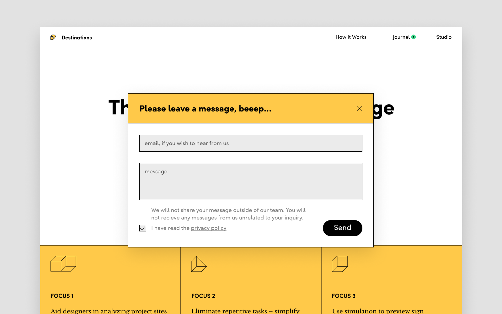
Facilitating Discussion
Section titled Facilitating DiscussionOne of our main goals was to get in contact with potential partners or signage designers, get feedback and engage in discussions. For this reason we decided to build a message system instead of a contact email that is usually seen. Visitors can simply write anything they like, without having to worry about writing a whole email and if they want us to respond they can leave their email as well.
Back to our website. Next we have a ‘How it works’ page detailing our application concept. They include similar content to our old website, but expand on it and are brought in line with our new identity.
The studio page is another new addition, where we want to present ourselves as a team, show our story and the developments so far. It also lowers the barrier by giving people that are interested in the project a look at our team members before contacting us.
Development
Section titled DevelopmentDevelopment of our new website was led by me, with additional work done by Johanna Wellnitz. The site is based on the template engine Jekyll with JavaScript for handling the message pop up and it’s states. A first for me was using PHP for our message delivery backend. Having no prior experience developing an actually interactive website the idea to let visitors send messages to us was challenging (a bit daunting even) as I had no immediate solution in mind.
I researched various options and settled for using PHP’s built-in mailing module. It would be interesting to talk more about the pros and cons of other options, but discussing them would be out of scope for this post.
It was a quite smooth experience developing the website, building new parts and having my progress deployed live on GitHub pages was nice to see. It was very fun to see my team members checking in some changes, and then discussing them in the evening together with pull requests. While leading the development of this page came naturally because I was also the main contributor, I started to assign my teammates some tasks to help me out like testing, writing texts, designing favicons and so on.
The Project can be found on GitHub.